DIA: Company Book
DIA is a branding and graphic design studio specializing in kinetic identities and typographic systems. Headquartered in NYC and Geneva, Switzerland, they developed a new approach to designing identity systems where motion is foundational and creative tools always accompany brand guidelines.
Concept
Graphic design company book is a physical version of the online portfolio for a particular company. Company books must have information not only about the works, even if it is the focal point of the whole book, but also a story behind all of these projects. Information such as a biography of the artists and the history of the company itself creates a good story flow that will help the reader to understand the whole picture of the projects but not only the top of the iceberg.
Theme
The word kinetic means relating to the motion. Since the early twentieth century, artists have been incorporating movement into art. This has been partly to explore the possibilities of movement, to introduce the element of time, to reflect the importance of machines and technology in the modern world, and partly to explore the nature of vision. Kinetic art became a major phenomenon in the late 1950s and the 1960s. In the 1960s artists such as Bridget Riley and Victor Vasarely experimented with geometric shapes that distort the viewer’s perception, creating artworks that, although static, give the impression of movement.

Material
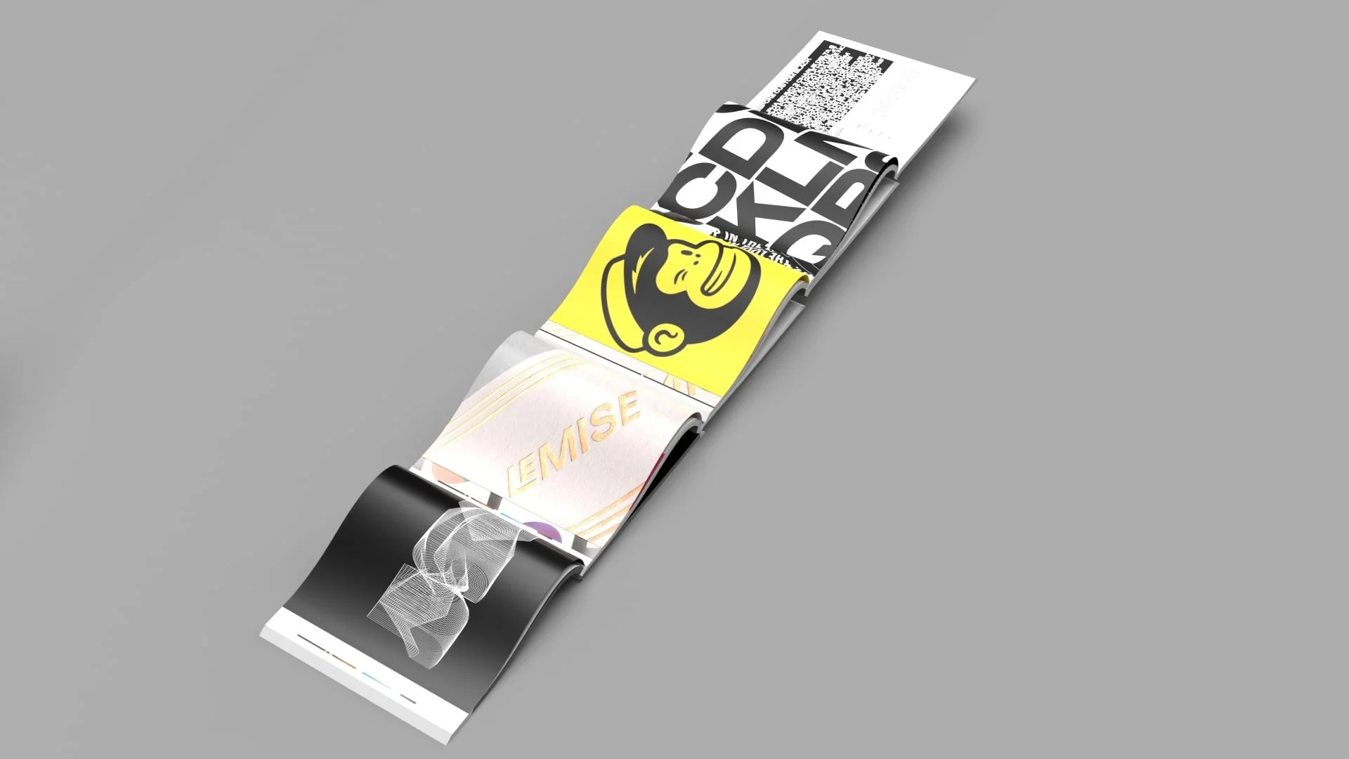
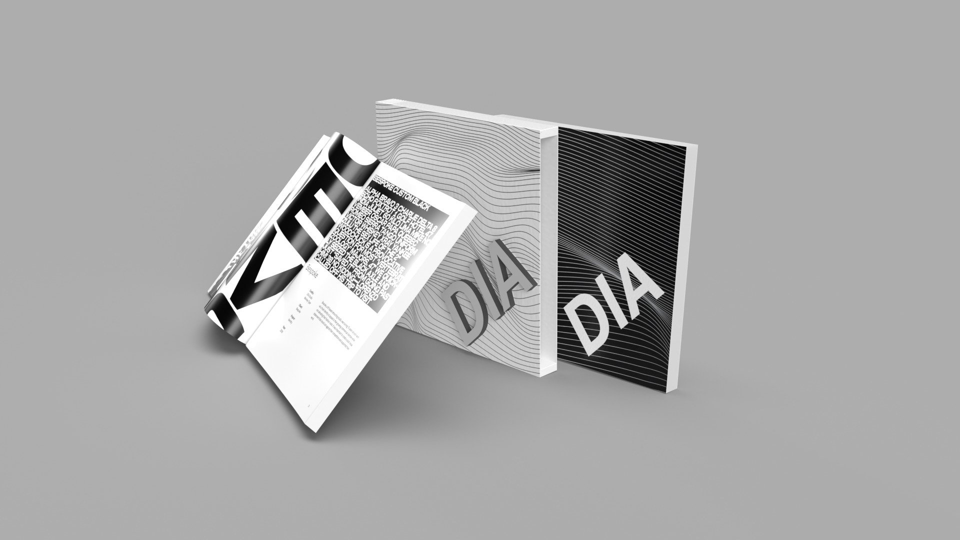
DIA company books have a static-kinetic type cover with the same style breaking pages in between the chapters. History of the company along with the biography of the designers. The biggest portion of the book is dedicated to their projects that have a description of the project, client name, and year.
“We challenge ourselves, our clients, and convention…”